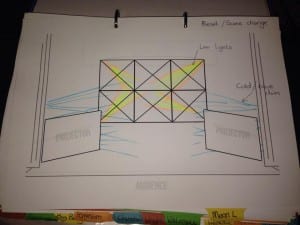
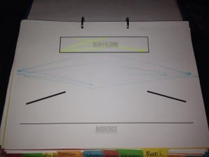
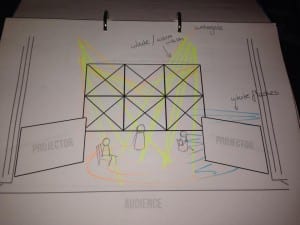
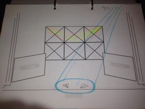
I also took time to help design and sort the problematic issue of lighting. How do you light a stage full of projections and projection screens? Each projector is it’s own light source and you must not have light spilling onto the screens or it just looks ridiculous. I decided to have everything very simple and central with small lights to light the scaffolding at the back and some sidelights to give it a more abstract and interesting look.
In the designs, it works, and looks good.
Here are are few examples of the front and birds eye view of the lighting and set. Here you can see the pre-set look, the watergate scene, and the 9/11 scene. I made a digital version of the set on the computer, then used highlighters to show where I wanted the lights on each page.
However, in practice, it became clear that light spill happened a lot easier than expected and some of the sidelights just looked cheesy. In light of this (excuse the pun) I chose to bring back lights into scene changes – similar to how Headlong chose when passing time in Romeo and Juliet – to give an abstract look to the stage and to give light to people moving set and props. This looked incredibly good and also replicated old timey camera projectors. If I knew it was possible for them to have a flickering effect, it may have been something I tried, but I didn’t know, so they just stayed simple and dim.


